 Codify
Appearance
组件解析
Codify 能将设计组件映射到前端组件上。这意味着你可以轻松地生成真实、可交互的前端代码。
如何使用
建议你在尝试编写时:
- 了解前端组件库的 Props 属性
- 至少完成了一个设计组件的结构设计,或使用我们为你提供的 Figma 组件模版
- 根据学习路径,顺便了解 样式解析程序 和 渲染器选项 的作用
起步
我们将从第一个组件开始,由浅入深的学习,让你轻松掌握整个过程。以确保你能轻松生成符合项目需求的代码。
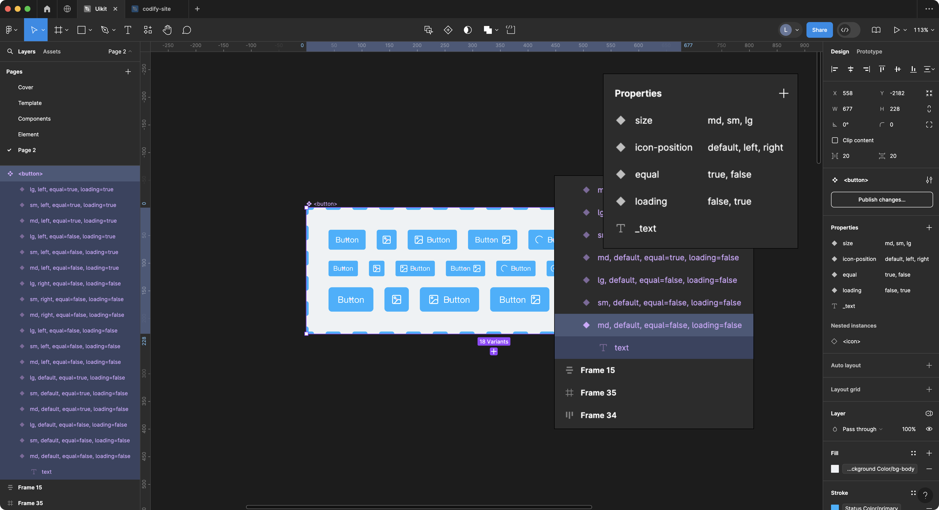
首先我们创建了一个 名为 <button> 的组件和它的各种变体。同时还选择了 text 图层作为组件的文本内容。下面我要做的是在 Codify 后台的 component_parsers.json 文件中编写解析这个 button 组件的配置。
最简单的组件解析配置
下面的代码,用于声明你要解析的组件名称。
json
// component_parsers.json
{
  "button": {},
  "input": {},
  "select": {},
}
Codify 会将使用 <> 尖括号包裹的图层名称标记为一个前端组件,例如 <button> <input> <select>。此时,你在生成代码的时候会得到:
html
<button></button>
<input />
<select></select>
<!-- 如果你在 特征设置 中设置了组件前缀将得到 -->
<el-button></el-button>
但是它并没有输出任何内容和属性。此时你需要通过 渲染器选项 来为组件添加它的渲染内容。
使用样式解析器来解析多个图层
通常在组件制作时,我们会读取的多个图层的属性来作为组件的属性。例如:
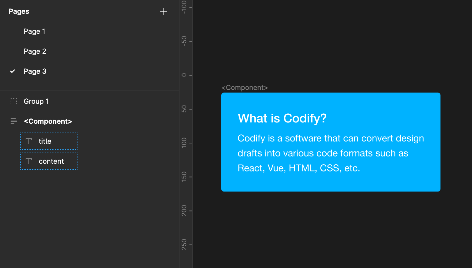
html
<Component title="Title text" subtitle="Description text" />该组件需要读取一个文本层的内容来设置 title,并将另一文本层的内容设置为 subtitle。 在这种情况下,你可以使用数组类型样式解析器来分别解析这两层。 这是一个例子:
WARNING
可能你会尝试下面的写法。但它是不能正常工作的,因为第二个text解析器会覆盖第一个text解析器。
json
// 错误示例
"Component": {
  "text": {
    "nodeName": "title",
    "textAttr": "title"
  },
  "text": {
    "nodeName": "content",
    "textAttr": "subtitle"
  }
}
正确的方法是使用数组
json
// 正确的示例
"Component": {
  "text": [
    {
      "nodeName": "title",
      "textAttr": "title"
    },
    {
      "nodeName": "content",
      "textAttr": "subtitle"
    }
  ]
}
你也可以在下面的配置中找到类似的使用示例
渲染器选项
通过 渲染器选项 可以为组件定制组件的解析方式。
json
"button": {
  "props": {},
  "text": {
    "params": {
      "nodeName": "text"
    }
  },
  "type": {
    "params": {
      "valueFrom": "background"
    }
  },
  "disabled": {},
  "flex": {}
},
其它的组件配置方式与 button 配置方式类似。Codify 提供了一套演示组件和配置,你可以在 资源社区 中下载并演示。
重命名组件名称 name
你可以为组件设置 name 选项以重写组件的名称
json
"button": {
  ...
}
// 默认渲染为
<button>...</button>

// 增加 name 选项
"button": {
  "name": "my-button"
}
// 渲染为
<my-button>...</my-button>
属性解析器 props
props 用于读取和解析设计文件中的组件属性。参考设计组件制作规范
json
"props": {
  "filter": ["md", "default", "false"]
}
默认设置了3种过滤的属性,当你的设计组件实例使用了以上属性,它将不会被解析成代码。如果你不想过滤任何属性,请设置:
json
"props": {
  "filter": ""
}
showTrueValue
- Type:
boolan - Default:
false
是否显示 true 值。通常情况下,true 值会被忽略。例如:
jsx
"props": {
  "showTrueValue": false
}
// 输出
<Button disabled />

"showTrueValue": true
// 输出
<Button disabled={true} />
遍历解析器 traverse
通常情况下,遍历解析器会在解析组件时检查组件解析程序提供的条件,然后决定是否继续渲染子节点。这样一来,你可以根据自己的需求来控制组件的解析结果。
json
"traverse": {
  "filter": ""
  // 可以通过 filter 过滤选项来排除不用遍历的节点名称
}
如果你设置了特征库的 ignore_prefixes ,系统将优先过滤配置里的节点名称。
多用途属性解析器 attr
attr 是一个多用途属性解析器,它支持 background borderColor color radius borderStyle opacity gap padding boxShadow 的样式解析
它能做什么?
我们可以通过 attr 属性来获取节点的指定样式,从而给组件加上相应的属性,这可以帮助你大量的减少组件变体的制作。
例如,当你希望给按钮输出一个 outlined 属性,你可以使用 mappings 来映射 borderColor 的样式:
jsx
"button": {
  "props": {},
  "flex": {},
  "attr": [
    {
      "valueFrom": "borderColor",
      "attrName": "variant",
      "mappings": {
        "primary": "outlined",
        "success": "outlined",
        "warning": "outlined",
        "danger": "outlined",
        "info": "outlined"
      }
    }
  ]
}
// output
<Button variant="outlined" color="error">
  Error
</Button>
案例 2:
根据没填充背景色的按钮来输出 text 属性
jsx
"button": {
  "props": {},
  "flex": {},
  "attr": [
    {
      "valueFrom": "borderColor",
      // ......
    },
    {
      "valueFrom": "background",
      "attrName": "variant",
      "mappings": {
        "none": "text"
      }
    }
  ]
}
// 可以得到下面的结果
<Button variant="text">
  TEXT
</Button>
案例 3:
根据Corner radius 来获得一个药丸形态的按钮
jsx
"button": {
  "props": {},
  "flex": {},
  "attr": [
    {
      "valueFrom": "borderColor",
      // ......
    },
    {
      "valueFrom": "background",
      // ......
    },
    {
      "valueFrom": "radius",
      "attrName": "shape",
      "mappings": {
        "9999px": "round"
      }
    }
  ]
}
// 可以得到下面的结果
<Button shape="round">
  Round Button
</Button>
图标解析 icon
解 使用 icon 解析器,可用于解析的图标组件。你可以通过设置 nodeName 来获取指定图标图层的名称。例如我们为 Button 组件设置图标属性:
jsx
"Button": {
  "props": {},
  "text": {
    "nodeName": "_text"
  },
  "flex": {},
  "icon": {
    "attrName": "icon",
    "nodeName": {
      "name": "icon",
      "deepFind": true
    }
  }
}

// 可以得到下面的结果
<el-button type="primary" :icon="SearchOutlined">
  Search
</el-button>

// React 的组件可能是这样
<Button type="primary" icon={<SearchOutlined />}>
  Search
</Button>
使用 getComponentName 将图标渲染为指定的值
- Type:
boolan|string - Default:
false
getComponentName 可以设置渲染为 变量、对象 或者 字符串。例如我们解析一个 React 的图标组件:
jsx
"Icon": {
  "icon": {
    "nodeName": {
      "name": "icons",
      "deepFind": true
    },
    "attrName": "value",
    "getComponentName": false
  }
}
// 渲染为 对象
<Icon value={<SmileOutlined />} />

// 渲染为 变量
"getComponentName": true
<Icon value={SmileOutlined} />

// 渲染为 字符串
"getComponentName": "string"
<Icon value="SmileOutlined"} />
使用 childComponent 将图标渲染为子元素
默认情况下,icon 解析器会将图标渲染为组件属性。但是,你也可以通过设置 childComponent 来将图标渲染为一个单独的子元素。例如:
js
// 例如,我们有一个名为 Button 的组件
// 并且,假如你的图标名称为 @SearchOutlined
"Button": {
  // ...
  // 解析图标组件
  "icon": {
    "nodeName": {
      "name": "icon",
      "deepFind": true
    },
    "attrName": "#icon", // 设置图标组件的属性名称为 #icon
    "childComponent": {
      "parentType": "slot",  // 设置图标组件的父元素类型为 slot
      "parentTag": "template" // 设置图标组件的父元素标签为 template
    }
  }
}

// 可以得到下面的结果
<Button>
  <template #icon>
    <SearchOutlined />
  </template>
</Button>
公共图标组件
如果你想批量解析图标,而不希望为每个图标都单独配置组件解析。你可以在设计文件中将图标图层名称设置一个 icon_prefix 规则,即可自动解析为图标组件,并得到以下的结果:
jsx
// 图层名称
// @SearchOutlined

<SearchOutlined />
如果你需要公共图标组件可以输出样式属性,你可以按如下设置:
json
// 1. 打开 component-parsers 配置界面
// 2 .在文件中添加:

"@icons": {
  "width": {
    "filter": "",
    "classPrefix": "",
    "stylePrefix": "font-size",
    "getCssVar": true
  },
  "background": {
    "classPrefix": "",
    "stylePrefix": "color",
    "nodeName": {
      "name": "Vector",
      "deepFind": true
    }
  },
},
// 其它的组件解析配置 ...

// 你将得到如下结果:
<SearchOutlined fontSize="24px"  color="#000"/>
公共文本组件
为你的文本内容使用特定的标签,例如 <text>name</text>,这能有效避免频繁调用“文本组件”的繁琐操作。
json
// 1. 打开 component-parsers 配置界面
// 2 .在文件中添加:
 "@text": {
    "name": "abc-text", // 使用重命名属性
    "text": {},
    "width": {},
    "height": {},
    "minWidth": {},
    "maxWidth": {},
    "minHeight": {},
    "maxHeight": {},
    "display": {},
    "flex": {},
    "justifyContent": {},
    "alignItems": {},
    "color": {},
    "fontSize": {},
    "fontFamily": {},
    "textAlign": {
      "filter": [
        "left",
        "text-left"
      ]
    },
    "fontWeight": {
      "filter": [
        "400"
      ]
    },
    "lineHeight": {},
    "letterSpacing": {},
    "background": {},
    "borderStyle": {},
    "borderColor": {},
    "borderWidth": {},
    "opacity": {},
    "boxShadow": {},
    "position": {}
  },
// 其它的组件解析配置 ...

// 你将得到如下结果:
<abc-text>文本内容</abc-text>
插槽 #slot
icon 用于解析的图标组件。你可以通过设置 nodeName 来获取指定的图标。例如我们为 Button 组件设置图标属性:
jsx
"Button": {
  "props": {},
  "text": {
    "nodeName": "_text"
  },
  "flex": {},
  "icon": {
    "attrName": "icon",
    "nodeName": {
      "name": "icon",
      "deepFind": true
    }
  }
}

// 可以得到下面的结果
<Button type="primary" iconPosition="start" icon={<SearchOutlined />}>
  Search
</Button>
如果你希望单独解析图标,你可以在设计文件中,将图标放在名为 @icons 的容器下,即可自动解析为图标组件,并得到以下的结果:
jsx
<SearchOutlined />然而,这不需要你做任何设置。
对象解析器 object
你可以通过 object 对象解析器来将子组件渲染成一个数组对象
jsx
// 例如一个常见的 React 组件
const App: React.FC = () => <Tabs defaultActiveKey="1" items={[
  {
    key: '1',
    label: 'Tab 1',
    children: 'Content of Tab Pane 1',
  },
  {
    key: '2',
    label: 'Tab 2',
    children: 'Content of Tab Pane 2',
  },
  {
    key: '3',
    label: 'Tab 3',
    children: 'Content of Tab Pane 3',
  },
]} />;

// 在默认情况下会被渲染成这样:
<Tabs defaultActiveKey="1">
  <Tab.Item key="1" label="Tab 1">Content of Tab Pane 1</Tab.Item>
  <Tab.Item key="2" label="Tab 2">Content of Tab Pane 2</Tab.Item>
  <Tab.Item key="3" label="Tab 3">Content of Tab Pane 3</Tab.Item>
</Tabs>
使用 object 将其子组件渲染成对象
json
{
  "Tabs": {
    "props": {
      // 在解析属性时,使用 customProps 选项, {items} 为属性名称
      // 同时也指向子元素的 object 解析程序的 name
      "customProps": "{items}"
    },
    "traverse": {}
  },
  "Tab.Item": {
    "props": {},
    "traverse": {},
    "object": {
      "name": "items",
      "mappings": {
        "key": "",
        "label": {
          "text": {
            "nodeName": "_text"
          }
        },
        "children": {
          "text": {
            "nodeName": "_text"
          }
        }
      }
    }
  }
}